
Coding
October 30, 2013 § Leave a comment
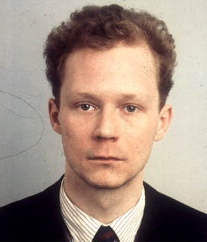
This session was about using the same coding technique and process on a photo. We chose a passport photo, because it’s simple and sort neutral. The coding in this session will mess with the pixels in this photo, the coding will decide how big the pixels will be and how quick u want them to. Basically what this will do to the pixels is to move them from their original place into a random place within the canvas.
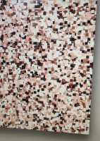
This is the result of the coding for the passport. As you can see it looks pretty abstract, and everything looks a mess
The codes required for this are as follows:
void setup(){
photo=loadImage(“source.jpg”);
size(photo.width,photo.height);
imsize=photo.width*photo.height;
println(imsize);
}
void draw(){
// image(photo,0,0);
for(int lop=0; lop<20; lop=lop+1);{
random(imsize);
curplace=int(random(imsize));
color thispix=photo.pixels[curplace];
fill((thispix),40);
stroke((thispix),40);
rect(random(photo.width),random(photo.height), 10,10)
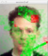
Next was to add brush strokes onto the photo.
int impos;
float curx;
float cury;
float targx;
float targy;
float brushsize;
void setup(){
face=loadImage(“source.jpg”);
size(face.width,face.height,OPENGL);
curx=random(face.width);
cury=random(face.height);
targx=random(face.width);
targy=random(face.height);
brushsize=5+random(80);
}
void draw(){
fill(0,255,0);
rect(curx,cury,brushsize,brushsize);
fill(255,0,0);
rect(targx,targy,brushsize,brushsize);
curx=curx+((targx-curx)/7);
cury=cury+((targy-cury)/7);
if(targx-curx<5){
//Close in x axis
if(targy-cury<5){
//Close on y axis
// Give new value to strokes
curx=random(face.width);
cury=random(face.height);
targx=random(face.width);
targy=random(face.height);
brushsize=5+random(80);}
}
for(int lop=0;lop<80;lop++){
impos=int(random(face.width*face.height));
color x=face.pixels[impos];
stroke(x,40);
fill(x,40);
int drawy=impos/face.width;
int drawx=impos-(drawy*face.width);
rect(drawx,drawy,10,10);
}
Lecture: Colour psychology
October 30, 2013 § Leave a comment
Like we spoke about the importance of colour on the last lecture. This lecture is similar but it speaks about the psychological part of it, and how it effect us mentally. Colour plays with our emotions and it is so important to the point where it makes us decide wether we want it or not, just on the colour aspect on the thing.
primary colours- red – yellow – blue
seconday colours- green – purple – orange
mixing all these colours could result in creating over 7 million colours, with of course adding black and white.
We then spoke about the relation between colour and emotion. We related colours to where we find them most, like we said that red and orange are warm colours, and we mainly see red and orange in fires for example volcanos.
We Then did a colour exercise on how we see colour and relate to things in our world.
Red – evil, danger, fire, warmth, hot, burn, blood, health
Blue – water, wet, cool, cold, ocean, sky, life
Green – nature, trees, oxygen, also illness
White – good things, pure,
After the little exercise, we watched a video about a little girl in red on the Schindler’s list, how the girl stands out from the black and white video. She’s the only one in colour which could symbolise danger or target or the main focal point.
WORKSHOP: Cutting
October 29, 2013 § Leave a comment
Using the Adobe Creative cloud for the first time.. I think. first lesson was about learning the basics of this software. The tool we got to learn in this lesson is the pen tool, its a tricky one, but once you get used to it, it becomes easy.
First click will make the first anchor point, but you don’t see the line until you click again somewhere else on the page.
To make a curve. You click and hold on the mouse, then drag the point until you’re happy with the curve.
The next chapter of the lesson was to use the pen tool on an image. Cutting around it and getting rid of the background.
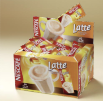
After going around the image, in this case it’s latte sachets box. We have to make a selection to select the path we made. To do that we simply click on ‘make selection’ on the drop down menu or right click on the path bar.
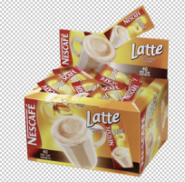
This is how it looks like after removing the background. Using the pen tool is better then using other tools is because it’s more precise on which bits you want to select. Using for example the magic wand tool will not result in more finer, smooth edges.
WORKSHOP: Coding
October 29, 2013 § Leave a comment
At last we are actually learning how to use new softwares, after a year of waiting. It is very hard and complex to learn but hey nothing is easy. The software we use for coding is called Processor app. It’s a good skill to learn and the outcomes of it is actually really interesting and there’s so much you could do with it.
Before doing any coding. there is a process of words we have to type in to get the computer to understand our intentions and what we’re going to do. First thing we type in is void setup () { we leave an open bracket and all the coding goes in between the open and closed bracket.
You must always finish your instruction with a ; this indicates to the processor that we are about to start a new instruction. This example should produce a image of the word hello in the bottom section.
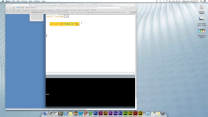
To make the computer draw anything. we must tell it to draw, therefore the code words for that is println(‘drawing’);.
Now the computer does not actually know what to draw, thats why it’s repeating the word draw over and over again.
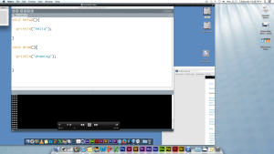
we to first make a canvas size, background, colour/fill, then the stroke… size(1024,768); background(255,255,255); fill(100,100,100); stroke(100,100,100);
I know there’s a lot of numbers involved in this, it’s called coding for a reason lol. there is a way of storing numbers in the system rather then repeating it. The code words for this is float xpos;. when you type this in, the computer will then
xpos is the name of the line were about to draw. To make the line move we need to put the next sequence of codes xpos=xpos+3;
As promised. The line appeared and it moved around non stop. This first lesson on coding has been really complex and quite tough to get understand. I have to admit, during the lesson. I fell behind a few times, and had to ask the tutor to bring up to speed
Colour and Trends
October 28, 2013 § Leave a comment
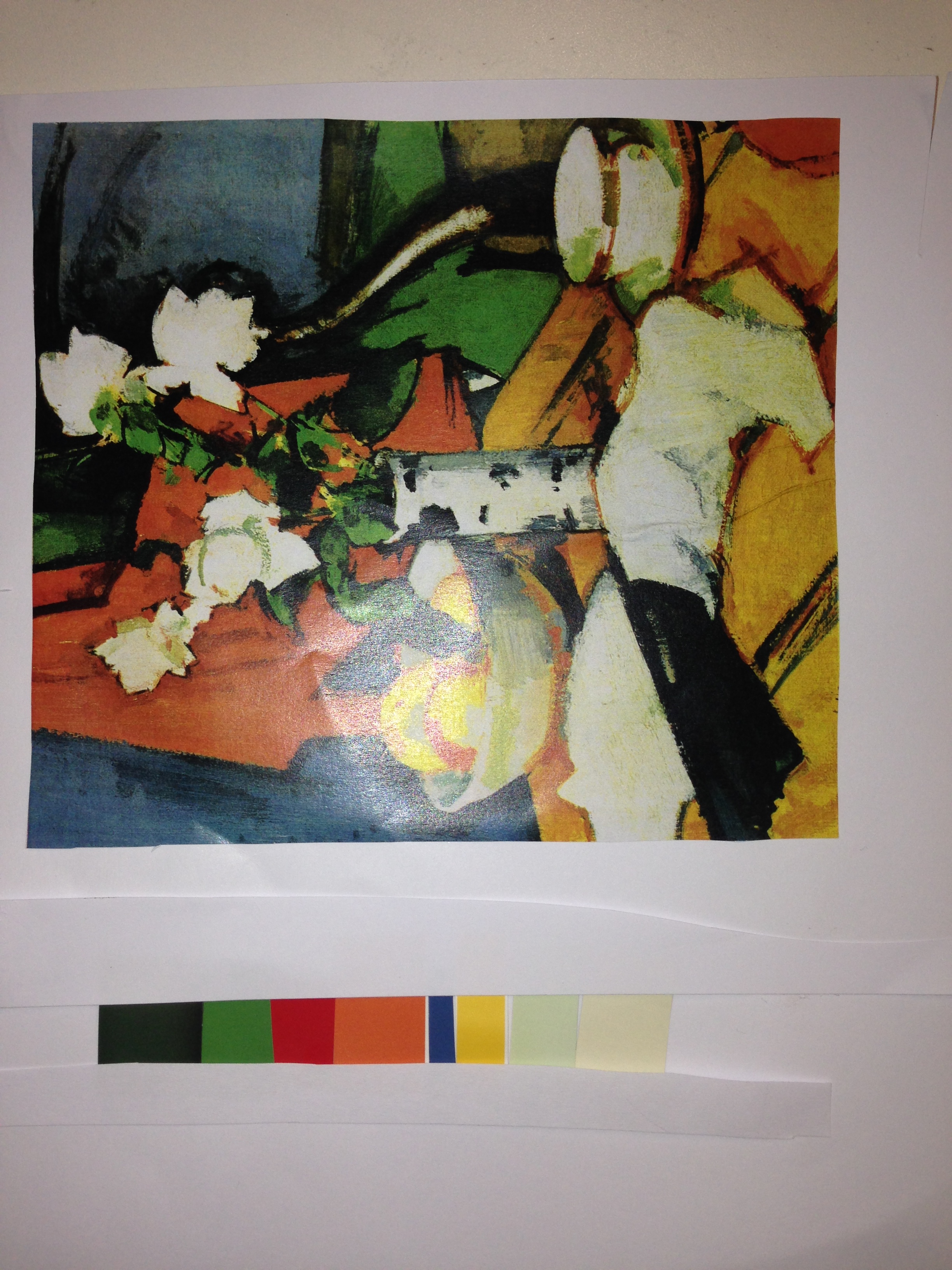
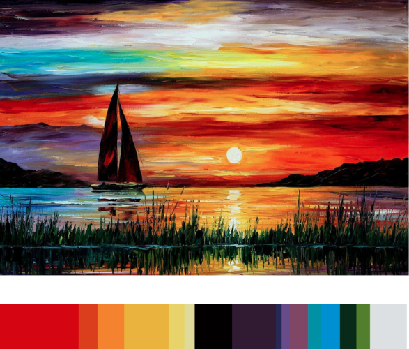
Margoe asked us to make colour stripes based from collected images from our choice. We used colour books from paint manufacturers. It was a bit difficult because it took so long to find the right colour. I managed to do two of deferent types. One done by hand using the colour books, and the other digitally using photoshop.
one done by hand Digital one
WORKSHOP: The Consumer
October 28, 2013 § Leave a comment
Today in the studio we talked about us as consumers. We spoke about the importance of the social media and it plays a big part in creating the creative network and engaging with others around the world. We were also told about our target audience, which were students in Hong Kong. These students are of the same age as us and they study design and animation. We were asked to write down on a piece of paper things that makes us unique from others, and things that we like doing, and so did the Students of Hong Kong. We then spent around 20 mins comparing the two together, and spoke about the defereneces. The reason for this was to give us an idea of how the design world works and how important it is for us to understand the global design industry and more importantly understand our clients, no matter where they come from.
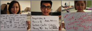
Some of the Hong Kong students with their feedback on what they think is important in their social and home life
Colour and Trend
October 27, 2013 § Leave a comment
In this lesson. Margo (tutor) started talking about the history of colour and how people thousands years ago used to make colours. In todays life. Colour plays such an important role into sending the intended message to the people (consumer), because colour plays with our emotions, and getting the right balance between colours is everything.
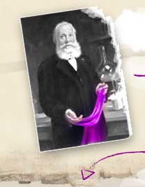
In this lesson we also learnt about how colour was extracted from natural resources. For over 3000 years. Colours used to dye our clothes and make our paint etc was obtained from animals, plants, and minerals, and the process of making the colour was tough and time consuming. All this changed when a chemist student William Henry Perkin found a way to produce colour using waste from coal gas industry products.
We then talked about colour in films. film producers/directors focus so much on colour, and pay a lot of attention on how colour is used in their films. Adding wonderful colour effects could make the film a lot better, like for example the orangey colour in ‘Mr Fox’ film adds warmth and comfort to the it. We were shown many examples but the that stood out to me was the film by Wes anderson ‘ The darjeeling limited’
http://www.metacafe.com/watch/mv-4QymA/the_darjeeling_limited_snake_escape/
New Brief: conceptual interests and philosophical underpinning of design.
October 27, 2013 § Leave a comment
“When writing a paper for a conference, journal or festival, typically you are writing in response to a theme. The challenge of this assignment will be to work with a general theme of a conference/journal to develop a topic that will be of interest to other conference delegates or to the audience of the journal in question.
The module explores the conceptual interests and philosophical underpinnings of design. It is important that a paper presented at a conference makes a salient point whilst addressing and engaging with the interests of its audience.
In this first semester you should focus upon developing an understanding of a number of theorists relevant to the kinetic, imagistic and functional concerns of the discipline of design.
The focus in semester two will be upon:
i) Developing a question/problem to explore that is pertinent to the theme of a conference.
ii) Understand the context of the question (find out what other work has been done in this area). iii) Identifying key technologies, techniques, theorists and practitioners that relate to your topic iv) Production of an enlightening, interesting and persuasive piece of writing.”
Lecture: Optical Illusion & Perception
October 27, 2013 § Leave a comment
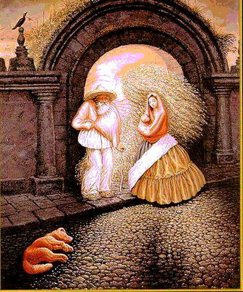
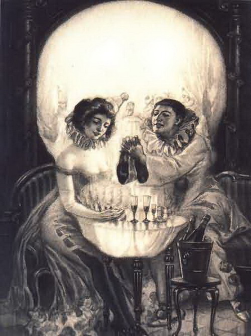
Our first Lecture of the year was about optical illusion. A subject which wasn’t exactly easy for me to get.
Optical illusion is mainly an image created by deferent objects, which then get positioned in places to make another image.
Its up to the eye which to spot the image created by the objects. There are three main types: literal optical illusions that create images that are different from the objects that make them, physiological ones that are the effects on the eyes and brain of excessive stimulation of a specific type (brightness, colour, size, position, tilt, movement), and cognitive illusions, the result of unconscious inferences.
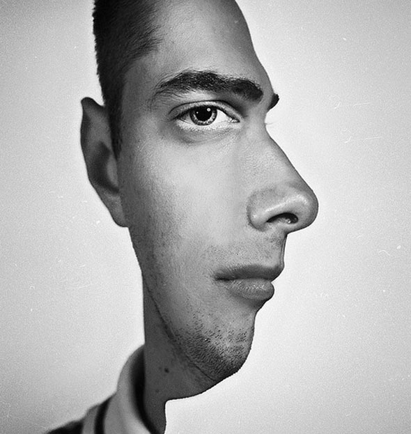
An example of an physiological illusion:

this example makes the human eye think that square ‘A’ and ‘B’ are not the same colour, but when the image puts the two square next to each other. they do appear to be exactly the same colour.
some examples of Literal illusion:
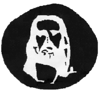
The most interesting illusion, and the illusion that has really worked on my eyes is the Jesus black and white piece.|
what you basically do is, stare at the image for twenty seconds or so, then straight after look at a white wall, which then you’ll see Jesus on the wall, in detail as well. for this to work well. I think you need the right amount of distance between you and the wall&image.
Workshop: Unerstanding Layers
October 24, 2013 § Leave a comment
Our first lesson on the module ‘thinking and practice’ was about layers and understanding them.The lesson mainly consisted of using the pen tool to select deferent areas of the scanned in image, and using the bucket tool, with of course selecting your own choice of colour, then colouring the selected area of the image. 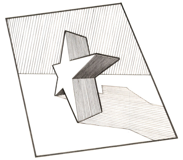
This was the image of the star I scanned in before it was edited.
I was asked to change the blending mode from ‘normal’ to ‘overlay’, its because when I start adding deferent colours which are technically layers on top of layers, I will still be able to see the original lines and details from the scanned in image.
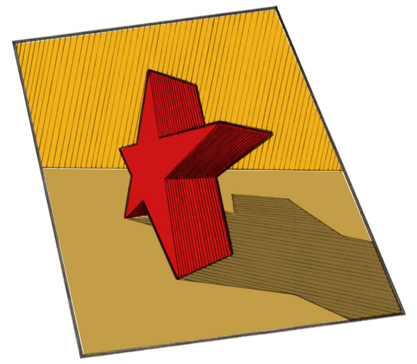
This is how the final outcome looked like. After adding deferent colours and experimented with them. I chose these colours (background and ground) because I thought there was some contrast between the red and brown and dark yellow. So far this lesson has taught how to use layers and how to use deferent blending modes to combine the layers to make work togeher, and also it has made more comfortable in using the pen tool.
